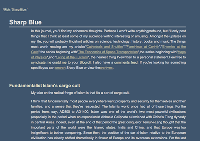
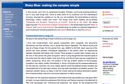
As you have probably noticed, Sharp Blue and most of its associated pages have been given an entirely new style over the last few days. There are still some rendering glitches in Internet Explorer 6 - I would strongly advise anyone still using it to switch to Firefox, Safari, Camino or at least Internet Explorer 7 as the CSS/DOM support in IE6 is utterly broken - and the pages don’t render correctly in narrow windows. Most of the images look wrong, as do the more complex layouts like my Review Queues. There are also no links to other weblogs and friends’ pages yet. All of this will be fixed soon.
When I designed the old Sharp Blue in late 2002, my intention was elegant simplicity. Partly this minimalism was a reaction to the explosion of visual clutter on webpages in the late 1990s and early 2000s. A secondary factor was that I wanted the text itself to be central, with as little intrusion by the machinery of the Web as possible. My lack of total lack of skill with CSS five years ago pushed me in the direction of minimalism too. Here’s how Sharp Blue used to look:

I hope that I’ve preserved something of the aesthetic stance of the old design in the new layouts and stylesheet but also brought it more into line with the visual vocabulary of the modern Web (at the cost, perhaps, of some distinctiveness):

The main change is a shift to a black-on-white colour scheme as the old scheme was quite a lot harder to read - a drawback to a site focused on text - and looked a little drab. This time around I’ve allowed mechanisms to intrude a little into the layout to simplify navigation, and allowed myself the indulgence of the occasional gradient tint. I hope you think these changes are a step forward.

|

|
I have moved a comment by Annette about Labyrinthitis to the thread on that subject. |
retty much nothing seems worth thinking about. My life's been completely dull , not that it matters. I've just been staying at home waiting for something to happen.